end of module evaluation:
I feel this course, especially this module, has been invaluable to me in terms of progressing as a designer. I feel this year, for me, has been the most focused in terms of what I want to be doing and where I want to be going. Since starting the module as the months have gone on I feel I have developed a direction within my practice that I am beginning to feel happy with. In the previous two years I have never really been happy with the end result or felt as though my design was a bit of a compromise either down to poor time management or lack of skill set. However this year, being as independent and as focused as it has been has really allowed me to develop work I can build on, ideas I can speak about confidently and work that could be put into a portfolio. I felt for the first part of the year (from september-december) I wasn't focused enough on extended practice, I felt like I hadn't got a clear direction yet and with focusing on COP I felt like that was distracting some of my practice. Before the december hand in I wasn't especially happy with anything I had produced, either the final outcome had been a disappointment, for example with Spectrum (collaboration with Emily Ball) the development and research were what we wanted to focus on and the final outcome ended up being a compromise and not turning out how we had wanted it. I felt from january onwards I had started to find a style and more focused area within design.
Since starting the course I had always been more interested in editorial and publication design but I felt in the second part of the year I began to produce more editorial work. I think being able to have your personal input in the briefs made the whole of extended practice really interesting and engaging for me as I was incorporating areas of interest I liked not only within graphics but outside of design. The COP publication was something I really enjoyed putting together as I felt it allowed me to sum up visually but also contextually what my practice has been about this year and the research that has gone into the ideas, briefs and decisions I've made. I think a big focus for me this year was research, I was really eager to try and incorporate as much primary research into my briefs as possible as I feel from past experience this made the final outcome of my design a lot more successful and innovative. There were various briefs (contemporary culture, unsung heroes and heroines, museum of childhood) that I had written up that relied heavily on primary research, and reflecting back on the module now I would say they have been some of my preferred briefs in terms of actually designing but also preferred in terms of the final outcome. I feel it allowed me to become more confident in engaging with the public and gathering an archive of research I could constantly refer to to improve my design. I feel this year a lot of skills have improved, because I have been engaged and enthusiastic about what I've been doing it allowed me to explore processes I wasn't that experienced in and was able to be happy with the outcomes. For example brief 03, Absolutely Fabulous, experimenting with screen print and colour was not only something I really enjoyed doing but I was happy with the results.
This year I feel I have incorporated photography into my work more than I have in previous years and I think my work has gained from this. I have been using a lot of film photography this year which I think is a really nice aesthetic that adds something to my work that can't really be imitated in the same authentic way. I feel this module more than any other has allowed me to develop a more consistent style within my work and presents a certain style and aesthetic that, although needs working on and improving on, I am happy with the ground work. Although I have always enjoyed working on the course I feel extended practice really gave me a freedom that
Funnily enough, towards the end of this year I feel I have progressed hugely in terms of technical skills such as inDesign and photoshop. Producing so many publications towards the end really allowed me to get to grips with inDesign in a more professional manner and I feel I can use it a lot more confidently now. The same goes for Photoshop, before this year I would of never of used it, not even to edit photographs, however after consistently trying to get the hang of certain techniques I now feel a lot more comfortable using it and can produce certain bits of work from it. I think another thing that has been a huge improvement for me this year is the photographing of my work, this is something, I've not learnt, makes all the difference to the presentation and professionalism of your own work. Before third year I had never booked a photography studio out or used any kind of lighting equipment. I could see straight away from the first shoot I did of my work how beneficial that extra bit of effort is, it can change the whole appearance of your final design. My one regret with photographing the work this year is running out of time to properly photography the publication Lisa and I designed for 'An exhibition of Paris' this is something we will have to revisit when putting the final bits of our portfolio together.
I've learnt the importance of development work this year as we had such long time periods to work on chosen briefs it really effected the final outcome for me as I kept trying to go further with the brief and on occasions the deliverables or outcomes of the original brief would change, however I felt this was beneficial to my design in the end as it was more thought through and thorough.
In terms of things I still need to improve upon, time management again is the one constant reoccurring thing. I felt this year was a real challenge as we were completely in charge of our own deadlines our own work ethic and our self discipline. I felt this improved hugely towards the second part of the year as in the first part of the year I felt I was still finding out exactly what I wanted to do. Although I feel there were some things that were impacted by some poor time management, I do feel like that has improved every year. Another thing I feel I need to focus on more is my attention to detail at the end of a project, I feel sometimes with the finishing touches I become slightly impatient and this could possibly impact on the end result due to lack of patience.
This course and this module has given me a completely new outlook on what I want to do and has motivated me in so many ways, it has given me a work ethic and a direction and the amount I have learnt and improved since starting has been a considerable amount.
Thursday 22 May 2014
Wednesday 21 May 2014
BRIEF 15: AN EXHIBITION OF PARIS//FINAL PRESENTATION BOARDS AND EVALUATION
brief 15_an exhibition of Paris (collaboration with Lisa Burns)
evaluation
This was a brief I enjoyed as the subject is something Im very interested in. I feel this brief allowed m to improve on quite a few skills such as screen printing, film photography and book binding. Lisa and I wrote the brief based on individual trips we were taking to Paris. This really allowed us both to do a lot of primary research, which i've noticed based on all my briefs, seem to have better outcomes when informed by first hand information. We explored a few processes, the most important being screen printing, which we did for the cover of the booklet, we also explored foiling which I thought was a good process for this brief. In terms of collaboration it was good to work with Lisa as we both had similar ideas about how we wanted the visual outcome to look and the type of aesthetic we wanted for the brief. I think one thing that really let the whole project down was the photographs of the final publication, due to bad time management the final photographs were rushed and do the final publication no justice. This is something we will have to rephotograph for our portfolios.
BRIEF 14: DIALOGUE//FINAL PRESENTATION BOARDS AND EVALUATION//OUGD603
brief 14_dialogue


 evaluation
This was a quick response for a brief written by Eve and Nathan to be involved with the dialogue exhibition which took place at the corn exchange. Even though ultimately I didn't use the primary research I collected I still enjoyed the process of collecting it and I will use these techniques and extend the certain area I was researching for a different brief. Originally my idea was to collect conversations and use this information to form a dialogue themed poster of random snippets of conversation. However, the idea never developed far enough as I came up with a new design that I thought fit more appropriately for the exhibition. I thought this brief was good in terms of having to work to certain requirements, because we have had the freedom to write our own briefs this year, most of the outcomes have been suited to the criteria I wanted. This brief allowed you to work to A3 scale, black and white and either vector or half toned images. Shockingly enough this was the first time I had learnt how to and used the half tone effect. I feel myself becoming slightly more confident on photoshop, which is really encouraging because a couple of months ago I wouldn't of even edited photos on there. Im learning, even though I am far more confident on illustrator, that some things are so much easier and effective when using photoshop. The design itself I was pleased with in the end as I thought it depicted the theme of 'dialogue' quite well. The photograph that I had taken fit perfectly for the quote that I found which really highlighted conversation/dialogue, from the catcher in the rye. I also made a colour copy which I think I would prefer in my portfolio, as the original design had to meet the requirements of the brief set.
This was a quick response for a brief written by Eve and Nathan to be involved with the dialogue exhibition which took place at the corn exchange. Even though ultimately I didn't use the primary research I collected I still enjoyed the process of collecting it and I will use these techniques and extend the certain area I was researching for a different brief. Originally my idea was to collect conversations and use this information to form a dialogue themed poster of random snippets of conversation. However, the idea never developed far enough as I came up with a new design that I thought fit more appropriately for the exhibition. I thought this brief was good in terms of having to work to certain requirements, because we have had the freedom to write our own briefs this year, most of the outcomes have been suited to the criteria I wanted. This brief allowed you to work to A3 scale, black and white and either vector or half toned images. Shockingly enough this was the first time I had learnt how to and used the half tone effect. I feel myself becoming slightly more confident on photoshop, which is really encouraging because a couple of months ago I wouldn't of even edited photos on there. Im learning, even though I am far more confident on illustrator, that some things are so much easier and effective when using photoshop. The design itself I was pleased with in the end as I thought it depicted the theme of 'dialogue' quite well. The photograph that I had taken fit perfectly for the quote that I found which really highlighted conversation/dialogue, from the catcher in the rye. I also made a colour copy which I think I would prefer in my portfolio, as the original design had to meet the requirements of the brief set.
BRIEF 13: THE COLLECTED WRITINGS OF ROSY LEE//BOARDS AND EVALUATION//OUGD603
brief 13_the collected writings of rosy lee
BRIEF 12: SECRET 7"//FINAL PRESENTATION BORADS AND EVALUATION//OUGD603
brief 12_secret 7" (collaboration with Emily Ball)


evaluation
I enjoyed collaborating on this brief, this was another outcome that I was happy with in the end, and learnt a lot from the printing experience. After collaborating on Spectrum Emily and I decided to collaborate on this as we work well together but didn't get the outcomes we particularly wanted from the brief. I felt this was a brief where the outcome was successful in terms of taking the brief into consideration, not only with how it turned out visually but also with the concept behind it. Emily worked on the visuals and I researched on how we could build a concept around it. The feel and atmosphere of the song and music is what influenced the visual behind it, the lyrics are what influenced the concept, the song being called karmacoma, I looked into karma symbolism in various cultures. This symbol (the endless knot) was embedded into the colourful and trippy pattern for a subtle result. After doing this we extended it further as I looked at how type could be incorporated into the design. I feel this brief taught me how to work to a tight deadline as the original design was done in one session. The biggest learning curve, that seems to be a reappearing theme this year is printing. When Emily and I first printed we were really unhappy with the colours, the design on screen involved a lot of vibrant colours which were dull and murky when printed on the stock we got from Leeds uni.
Again, something that I've mentioned that is beneficial to the overall outcome of the work is the photography. Again I used professional equipment in the photography studio which is something I'd never done before third year. We then went onto make another version of the sleeve that worked as a pair, contrasting in colours. Overall I am happy with the final result and I think the collaboration allowed us to create something we were both keen to try in terms off aesthetics.
evaluation
I enjoyed collaborating on this brief, this was another outcome that I was happy with in the end, and learnt a lot from the printing experience. After collaborating on Spectrum Emily and I decided to collaborate on this as we work well together but didn't get the outcomes we particularly wanted from the brief. I felt this was a brief where the outcome was successful in terms of taking the brief into consideration, not only with how it turned out visually but also with the concept behind it. Emily worked on the visuals and I researched on how we could build a concept around it. The feel and atmosphere of the song and music is what influenced the visual behind it, the lyrics are what influenced the concept, the song being called karmacoma, I looked into karma symbolism in various cultures. This symbol (the endless knot) was embedded into the colourful and trippy pattern for a subtle result. After doing this we extended it further as I looked at how type could be incorporated into the design. I feel this brief taught me how to work to a tight deadline as the original design was done in one session. The biggest learning curve, that seems to be a reappearing theme this year is printing. When Emily and I first printed we were really unhappy with the colours, the design on screen involved a lot of vibrant colours which were dull and murky when printed on the stock we got from Leeds uni.
After asking James we learnt that his paper would had chemicals in that would allow the colours to be printed to a much higher quality. Once the nets were printed and assembled we were happy with the final outcome.
Again, something that I've mentioned that is beneficial to the overall outcome of the work is the photography. Again I used professional equipment in the photography studio which is something I'd never done before third year. We then went onto make another version of the sleeve that worked as a pair, contrasting in colours. Overall I am happy with the final result and I think the collaboration allowed us to create something we were both keen to try in terms off aesthetics.
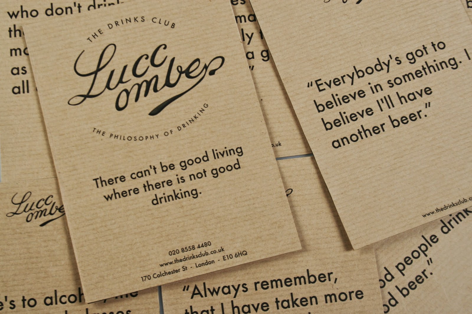
BRIEF 11: DRINKS CLUB//FINAL PRESENTATION BOARDS AND EVALUATION//OUGD603
brief 11_the drinks club
evaluation
This brief was something that contrasted with a lot of my other briefs as I hadn't done that much branding this year, however, I found this brief was enjoyable and although I wouldn't particularly favour branding as an area of graphics I would like to go into I did enjoy the process of this brief. This allowed me to gain a lot of experience woking for a client, this taught me about designing to meet other peoples requirements and needs and not just designing for yourself. However I did get a lot of freedom to take the brief in a direction that I wanted to, I found this to be a good balance between getting what I wanted from the brief but also delivering something to a client that they could be happy with. Something that I found quite satisfying with this brief was bringing all the products together to photograph, which I have taken a lot more care with this year than in previous. But bringing all the branded products together and photographing them as a collective allowed me to see how successful the brief had been as a range of products. I was faced with problems that I would not usually of thought about as much when designing publications, which is what I have done for the majority of the year, such as stock choice. I feel my drawing skills have improved from this brief as I drew the logo and then made it digital on illustrator. I think this brief also allowed me to work on my concept skills as it was quite a broad brief in terms of where I could take it. In terms of photographing the final products I liked how the photographs turned out but would of liked to of been more prepared with props, drinks etc. as I think this would of added to the overall image of the drinks club. This brief was the first time I had duplexed membership cards which I thought really added to the design of them and is something I will try and do with my self branding. Overall, for a branding project, something I am not strong at, I feel quite happy with the final outcome.
BRIEF 10: DR ME SAYS MAKE A FLAG//FINAL PRESENTATION BOARDS AND EVALUATION//OUGD603
brief 10_dr.me says make a flag (collaboration with Steph Buck)
evaluation
This was an interesting brief to do as its been the shortest one I've done this year and as it was a flag brief it was interesting to print on a different material as i've never really looked at printing onto cloth/material. I also enjoyed the collaborative aspect of the brief and the limited time scale as I feel this allowed us to generate ideas quickly, act on them and design all within a few days. Sometimes I find that refreshing as I can work on a brief for longer than I need to and it can sometimes result in me becoming frustrated with it or wanting to move onto something new.
For this particular brief, Steph and I had similar ideas of the kind of aesthetics we wanted to go for with the brief and the style, both in agreement that we wanted to create collages/photomontages. I thought with this brief the concept was quite strong as we firstly listed visuals that we would quote like to incorporate into the design such as maps, compasses, birds (all these themes encompass travel or journeys which we thought were appropriate for a flag design.) We then looked at how we could give the design a concept without just designing something that was visually to our taste. We researched into bird migration and the types of birds that migrate in certain directions and whether they head north, south etc. The research process in this brief was quite rewarding as I feel the research stages really helped develop the final design. Through research and thought out concept generation we then designed the final flag which displayed e map in a compass diagram with swallows.
Overall I am happy with the final flag design, although the printed version is slightly pixelated due to the scale of the flag and the image size we used.
BRIEF 09: MEANTIME//FINAL PRESENTATION BOARDS AND EVALUATION//OUGD603
brief 09_meantime


 evaluation
This was a brief that originally I hadn't written up or intended to do but sort of developed and turned into one of my longer briefs. I feel this was quite a significant brief in third year and changed the approach and feelings I had towards my final outcomes in third year. I feel the outcomes from this brief were one of the first deliverables that I was actually happy with and I had to overcome some printing issues to get the exact outcomes I wanted in the end and because of this the brief spanned from before Christmas until afterwards. I felt like I had quite a lot of freedom with this brief and the way I wanted to design it which always makes the brief more engaging and interesting. I was working with photographs I had taken and looking at visuals that could represent the lyrics and the feel/atmosphere of the song.
I also enjoyed extending the brief, when designing the four sleeves it kind of turned into making a logo for the band which I then put onto tee shirts (screen printed) and made stickers of. I feel doing this brief allowed me to improve my screen printing skills dramatically. Compared to the outcome of my screen printed tee shirts in second year the ink has transferred a lot better and looks a lot cleaner and more professional.
BRIEF 08: SPECTRUM//FINAL PRESENTATION BOARDS AND EVALUATION//OUGD603
brief 08_spectrum (collaboration with Emily Ball)
evaluation
evaluation
This brief was quite interesting as I found the research, process and development to turn out quite different to the final outcome, a change of direction Emily and I didn't expect. I thought throughout the early developing stages of collecting visuals and researching techniques we were organised and had a clear direction with what we wanted to achieve with quite a clear style direction in mind. However, the brief was left as the intensity of COP heightened and we felt we lost our memento with it a bit. We did manage to finish the brief before the December hand in which was encouraging, but the final outcome didn't involve the original ideas we had in mind.
The process ended up being a digital one rather than a manual, hands on approach that we'd looked into previously. Although we weren't entirely happy with the end results I felt the brief allowed us to research into techniques that I didn't know much about before and that hopefully we can use on the second part of the brief. We have decided to extend the brief and write up a spectrum part two for the next term so we can hopefully get results that we pictured originally.
In terms of the designs actually produced we found colour to be quite a difficult obstacle and eventually decided to keep the set of posters all in one colour as we thought this showed consistency throughout. The end products resulted in four posters and four promotional postcards, one poster Emily and I were particularly happy with, however given the opportunity again I feel we would do things differently.
BRIEF 07:PERSONAL MANIFESTO//FINAL PRESENTATION BOARDS AND EVALUATION//OUGD603
brief 07_personal manifesto
evaluation
This was quite a nice brief to be able to do as it focused on areas of design I wanted to create reflecting me as a designer. I felt this was an area that allowed me to focus on points and beliefs that I found important and try and visually display them through design. It was a nice summary in terms of things that I've learnt over the three years and allowed me to reflect a lot on previous PPP tasks that I have done over the my time on the course. I was also able to bring in some theories from third year COP. I think this brief was a way of summing up certain areas within design and just in general about all the things I'd taken from the course and the influences I'd collected whilst being on the course.
BRIEF 06: PROMOTING INTERRAIL//FINAL PRESENTATION BOARDS AND EVALUATION//OUGD603
brief 06_promoting interrail
evaluation
This was quite a quick brief in terms of the final outcomes but I enjoyed using my own photography, which was probably the first time in third year that Id started using my own personal photography for work and since then I have much preferred this way of working. The designs are quite simple, but after Interrailing myself and coming across their promotional material etc. I wanted to try and design something that looked a little more appealing for its target audience. I was directing the promotional material at students/people in their twenties as I feel this is usually the age group interrail mostly attracts. In terms of the digital design I am pleased with, however, after finishing other briefs further on into the year i have decided I will need to reprint these images. Learning from experience, the paper from the library will not allow the colour vibrancy to show as much, however matt paper from the digital print room will allow the colours to be displayed a lot more, I think this will definitely improve the final outcome of the printed versions. When I have reprinted them I also need to think about a way I can photograph them to look as professional as possible.
BRIEF 05: UNSUNG HEROES AND HEROINES//FINAL PRESENTATION BOARDS AND EVALUATION//OUGD603
brief 05_unsung heroes and heroines
part one
part two
evaluation
This was an on going brief that I felt really enabled me to develop something over a long period of time. In terms of developing ideas and pushing the brief I felt this was successful. This was another project that relied heavily on primary research to build the content of the publication, I found because I was engaging with people when collecting primary research it made the brief far more interesting and collecting this kind of information can be really engaging. The brief started out with me looking at one individuals story in particular but the brief developed further and I ended up exploring a few individuals stories which made the project more of a success, I feel. I enjoyed putting a wall display together which was later used for promotional material for the proposed exhibition, I realised I liked working on that kind of scale. I feel the biggest skill this brief has taught me is research skills, this was definitely a heavy research brief from start to finish, firstly researching into one unsung hero/heroine but then broadening the brief and looking at several peoples stories. I came across a lot of printing problems whilst trying to produce the final outcome, the images were either too dark so they ended up showing through on the other side or certain paper didn't print the quality of the scans well enough. I overcame this issue by ordering some paper from GF smith which I was pleased with in the end because it made a difference to the final printed outcome.
BRIEF 04: MUSEUM OF CHILDHOOD//FINAL PRESENTATION BOARDS AND EVALUATION//OUGD603
brief 04_museum of childhood
evaluation
This brief was on going from the start of the year when I started researching for it, however the final outcome was produced in the second part of the year. I felt working over a longer time scale allowed me to develop the brief and take it in a different direction to what I firstly intended. Originally the brief was to create some new branding and promotional material for the museum of childhood, however as the year went on and my practice developed I became more focused on publication design and so as I liked the subject matter of the brief I wanted to do something more linked with editorial design. As part of my research I visited the museum of childhood which was good for initial ideas and to look at the different kind of exhibitions that were on and the curation behind current exhibitions. After developing initial ideas with the branding area of the brief and looking particularly into the visual of childhood toys I gathered a number of sketches from individuals, ranging in age to get a contrast. I wanted to use these original drawings as part of the design for the promotional material, however when the direction of the brief changed the brief became a lot more focused and I knew the kind of outcome I wanted to create. My new concept was to propose an exhibition and design a publication that could either be sold or
I think this brief has allowed my primary research skills to develop further, the entire content of the publication is made up from on going gathered research on peoples childhood memories. This allowed the brief to constantly remain interesting which was important as it was considered over a long time period. I think my concept/idea generation has improved as I had to think about ways I could make the exhibition proposal relevant to the museum of childhood as well as consider design direction. This was a brief that enabled me to engage with people and therefore made the content of the publication more interesting.
BRIEF 03: ABSOLUTELY FABULOUS//FINAL PRESENTATION BOARDS AND EVALUATION//OUGD603
brief 03_absolutely fabulous (collaboration with emily ball)
evaluation
This was a really enjoyable brief for me as I found the processes we tried interesting and the collaborative aspect engaging and successful. I feel this brief massively helped improve my screen printing skills and I now feel a lot more confident in that area and a lot more interested in print all together. This was a brief Emily and I were both keen to do because we wanted to try and improve our screen printing skills. I felt this brief was a great opportunity to experiment with colour, print and imagery. This brief taught me the importance of planning and preparing before hand, the digital design was the quick and easy stage, whereas preparing screens, preparing our image for screen print and the process of actually screen printing was a lot more time consuming. We faced some problems during the exposing stage of the screen printing, when we thought we would have to clean and expose the screen again due to a technical mishap that wasn't down to us, however overcoming that problem made the brief more challenging and therefore more successful in the end. As this was the first time I had really experimented with these screen printing techniques, I think the final outcome has turned out well. This brief, probably more than any other brief I have collaborated on this year, showed the importance of collaboration. I feel Emily and I worked well together and it felt motivating to have someone with similar ideas and thoughts work together on what was quite a time consuming and at times stressful project. Collaboration, I feel this year has been quite successful, and Emily and I have collaborated three times this year, both being really pleased with two out of the three brief outcomes. We would quite like to continue and make another series of colourful screen prints, which is something we will try and do after the hand in.
BRIEF 02: MIXED TAPE//FINAL PRESENTATION BOARDS AND EVALUATION//OUGD603
brief 02_mixed tape
evaluation
I enjoyed this brief as, although the final outcome was only a film poster, the experience I got from working on a set and on various locations was a good opportunity. Throughout this brief I was quite enthusiastic and engaged as I was working quite closely with someone. Although the design element (the film poster) was designed by me individually the process of getting there felt like a collaboration. I feel from this brief I can take a lot more away with me than just the single poster designed at the end. The reason for the process being collaborative is because on several occasions I went out and helped film some scenes for the short film. This allowed me to get a clearer understanding of the film synopsis, the main character, the general style and aesthetic of the film and the directors ideas and what he wanted from the poster. With this brief I felt I learnt a lot about the importance of the development for a brief and also how to adapt and change some of my design to suit the clients taste. Being on set and helping gave me a great opportunity to get some photographs that I could work with for the promotional poster, which was my original intention. However it helped me progress with the design in different ways and I didn't end up using any of the photographs that I had taken on set. Because of filming and being in close contact with the director I was able to understand exactly the design direction the poster should take and how it could successfully represent the film in a way that the director is happy with.
In terms of evaluating my design I feel I have improved on photoshop, I created the poster on photoshop which is something I would never of done in previous years as I would not of felt confident enough to execute it properly. However, because of the design of the poster it benefited me to use the tools on photoshop which will be useful for designing in the future. I feel because of the time spent on this brief before the actual designing took place and the understanding of the film I grasped whilst helping allowed me to create a much more successful design and allowed me to make far more informed decisions about the direction of the brief.
I think the final poster communicates successfully what the film is about without giving too much away. With the feedback I received I was told the poster mirrored what the film is about in a still and that it was eye catching and left enough to the imagination. I think overall I'm glad with the final design and have enjoyed the experience this brief has enabled me to have.
BRIEF 01: CONTEMPORARY CULTURE//FINAL PRESENTATION BOARDS & EVALUATION//OUGD603
brief 01_contemporary culture
evaluation
This was one of my most enjoyable briefs and probably, in my opinion, one of the most successful. I think in terms of research skills, especially primary, this brief has allowed me to strengthen that area. It was a good opportunity for me to be able to contact some of my favourite designers and people from around the world to take part in the project, and because of that I felt really engaged with it the entire time. This is a project I would like to continue doing after the course and possibly try and extend it further in some way. I feel this brief embodies all the areas of graphic design I really love (editorial, photography, publication) as well as travel and culture. I think the biggest skill gained here is communicating with a range of people to help build the content for my publication. This was an on going brief throughout the year and so was something that I could keep coming back to and picking up. There were a few problems that were out of my control, such as cameras getting lost in the post, however, apart from that I was pleased with the photos I received back and the overall project when it came together. I feel this is one of the first briefs that I am happy with the final outcome and I think the journey of getting to the final point was a really interesting and engaging way to work on something which I will continue to do.
Monday 19 May 2014


BRIEF 15: AN EXHIBITION OF PARIS//BINDING BOOK//OUGD603
binding book
After printing and cropping the book Lisa and I clamped it with bull dog clips to allow the pages to remain as close as possible, this was fairly important as its such a thick book so having the pages fanned out made it look untidy and slightly unfinished. In terms of binding the book we needed to saddle stitch individual compartments, then the next stage would be to perfect bind the compartments to the spine of the cover.
 We split the booklet into seven sections, three for the french side, three for the english side and the middle divider which changes the way up of the book. We did a simple binding technique, using two stitches as the book is of a small custom sized, three stitches wouldn't of been necessary.

 Now all the separate sections are combined we need to think about the best way to perfect bind the book to the screen printed cover. Neither of us have done this process before so we have looked into the method and technique behind it.
 French and English section, the French section being translated for the first three pages, rest of booklet remains as photography. On opening title page information includes, title, sub heading -photographs of Paris, our names and the time period all the photos were taken in.

After printing and cropping the book Lisa and I clamped it with bull dog clips to allow the pages to remain as close as possible, this was fairly important as its such a thick book so having the pages fanned out made it look untidy and slightly unfinished. In terms of binding the book we needed to saddle stitch individual compartments, then the next stage would be to perfect bind the compartments to the spine of the cover.
Sunday 18 May 2014
BRIEF 04: MUSEUM OF CHILDHOOD//TEST PRINT/MOCK UP//OUGD603
test print, mock up:
This was a test print to see how the publication printed and whether anything needed to be amended before running the real print. Depending on time I have left will decide on the way I bind the publication. I would quite like to perfect bind but I don't know if the content is big enough for it to be worth it.

 stock:
In terms of stock I did a test print on the GF smith paper as I thought this would print the scanned images of the frames out really nicely, which it did. This is the paper I will be using for the final print as I think it compliments the scanned frames and the serif typeface also looks nice against the off white paper.


This was a test print to see how the publication printed and whether anything needed to be amended before running the real print. Depending on time I have left will decide on the way I bind the publication. I would quite like to perfect bind but I don't know if the content is big enough for it to be worth it.
In terms of stock I did a test print on the GF smith paper as I thought this would print the scanned images of the frames out really nicely, which it did. This is the paper I will be using for the final print as I think it compliments the scanned frames and the serif typeface also looks nice against the off white paper.
crit feedback:
I was struggling with the front cover for this particular brief as I didn't know quite how I wanted to display the exhibition on the front cover of the publication. I thought it was important that the cover featured a small passage of what the exhibition was about, putting the book into context. I wanted the cover to be quite simple and consistent with the design on the inside pages.
When in the crit I asked whether there should be any visuals on the front cover as I was quite aware that I didn't want to keep repeating the same visual frames throughout the book. The general feedback was that there should be some sort of colour or visual on the front. After discussing ideas I came up with the idea of a belly band that featured a few empty frames as imagery.
I thought this probably worked best as it allowed me keep the front cover quite plain and simple which is what I had intended but also allows a bit of colour and aesthetic of the outside appearance without being psychically printed. I may explore further with the idea and potentially cut out the space between each frame if I want text to appear coming through it.
Saturday 17 May 2014


BRIEF 11: DRINKS CLUB//DUPLEXING MEMBERSHIP CARDS//OUGD603
testing colours for branding:
Originally I thought about having the branding mixed with an off white/cream and a deep red/maroon colour. These are some stock samples I did to see which colour worked best. I also printed the comical post card quotes on the red stock to see what that turned out like. I think all the colours could of worked but I wasn't set on one at this point. Also the weight of the stock would play a contributing factor as it was going to be used for duplexing membership cards and so the thicker the stock the better the result would be.
 Applying sticker to glass:
I printed some clear stickers to apply to these glass bottles, it would of been better to be able to explore printing on glass techniques to make it look more realistic, however, when being photographed with the rest of the branding Im hoping the visible sticker lines do not appear to be to noticeable.
 testing stamp:
Printing mock ups of postcards and letter heads for the drinks club branding. At the footer of the postcard I have included the drinks club website. Applying the stamp to various areas of the design to see where works best and onto what stock it suits the most.
 drinks club: duplexing membership cards
After using the stamp to apply the logo to various stock choices I decided against the colours that I had tested. Originally I didn't want to print the branding on such a white stock as I thought this would look too clinical, and not quite the right feel for the drinks club. However after deciding I was going to duplex the business cards I thought having this as a feature would allow me to get away with the branding being printed on such a clean stock.
 The membership card features two different sides, one with the logo, the other side with the information on such as the drinks club motto, the address etc. I wanted to use to types of stock, at first I was going to go with just black as I thought this would be in keeping with the colour scheme so far, however as I had produced some wooden coasters and bill clipboard with the laser cutter I thought I could incorporate a bit of brown stock into the duplexing to allow the colour scheme to be more consistent.


Originally I thought about having the branding mixed with an off white/cream and a deep red/maroon colour. These are some stock samples I did to see which colour worked best. I also printed the comical post card quotes on the red stock to see what that turned out like. I think all the colours could of worked but I wasn't set on one at this point. Also the weight of the stock would play a contributing factor as it was going to be used for duplexing membership cards and so the thicker the stock the better the result would be.
I printed some clear stickers to apply to these glass bottles, it would of been better to be able to explore printing on glass techniques to make it look more realistic, however, when being photographed with the rest of the branding Im hoping the visible sticker lines do not appear to be to noticeable.
Printing mock ups of postcards and letter heads for the drinks club branding. At the footer of the postcard I have included the drinks club website. Applying the stamp to various areas of the design to see where works best and onto what stock it suits the most.
After using the stamp to apply the logo to various stock choices I decided against the colours that I had tested. Originally I didn't want to print the branding on such a white stock as I thought this would look too clinical, and not quite the right feel for the drinks club. However after deciding I was going to duplex the business cards I thought having this as a feature would allow me to get away with the branding being printed on such a clean stock.
Wednesday 14 May 2014
BRIEF 11: DRINKS CLUB//MOCKING UP BOTTLE LABEL//OUGD603
mocking up bottle label
Measuring and mocking up bottle labels for the drinks club. I ordered these small bottles to apply the logo onto the glass. It would of been a better outcome to try and print directly onto the glass, however due to the time scale I am on and considering the deadline, printing clear stickers will be the next best option.


Measuring and mocking up bottle labels for the drinks club. I ordered these small bottles to apply the logo onto the glass. It would of been a better outcome to try and print directly onto the glass, however due to the time scale I am on and considering the deadline, printing clear stickers will be the next best option.
After measuring the correct areas for the logo to be seen directly on the glass I have set up a document that is measured correctly to it so the most of the logo is able to be seen when facing the bottle face on. Will need to decide whether to include any other information on the label or if it would look better completely plain.
Subscribe to:
Posts (Atom)