
Friday 28 February 2014


BRIEF 12: SECRET 7//EXTENDING BRIEF AND INCLUDING TYPE//OUGD603
extending the brief and adding type.
As Emily and I were pleased with the final result for secret 7 submission we decided to try and push it a little further and see how it could look with some type, also with the possibility of making another design, either being a different colour or different pattern, for another track of the same album karmacoma was featured on, Protection.
type
My initial thoughts when adding type to the design, and also considering the nature of the song, was to go with a sans serif typeface, I don't think the song or design reflects a serif typeface at all. Spacing between each letter, I think will work when putting against the patterned design. The first design is making reference to the video imagery where someone is typewriting and the K does not appear when pressed.
 Simple and straightforward aligning Massive attack equally with the song title, below the song title has been flipped around, as almost a reflection of the band name, however the word karmacoma is larger which I think is important as its a sleeve for a single.

 As previously thought the serif typeface doesn't work as well against the design as a sans serif font, I don't think its particularly the backdrop that doesn't allow it to work, I just think the band and song don't suit a more delicate, classic typeface.
 I also tried standard Gill Sans which was originally the typeface I had in mind, but I felt the thickness of the bold worked better.
 variations of text and layout design, looking at a potential series or varied versions. Left hand side - textured stock, circular emphasis on the endless knot symbol as it is the main focus. Right hand side - positioning of text diagonally. Bottom left is the reference to the shot of the missing 'k' on the typewriter in the video. Bottom right, emphasis on the endless knot again - boxed with a thick black outline.


 Emily and I narrowed down the text version to either one below. The idea for the second one was to have the black circle and text working as a sticker.


As Emily and I were pleased with the final result for secret 7 submission we decided to try and push it a little further and see how it could look with some type, also with the possibility of making another design, either being a different colour or different pattern, for another track of the same album karmacoma was featured on, Protection.
type
My initial thoughts when adding type to the design, and also considering the nature of the song, was to go with a sans serif typeface, I don't think the song or design reflects a serif typeface at all. Spacing between each letter, I think will work when putting against the patterned design. The first design is making reference to the video imagery where someone is typewriting and the K does not appear when pressed.
test print - colours
Obviously because of the editing and the mix of colours we decided to test print to see what it would look like before printing it onto the stock of our choice. Before printing we were aware that the white ink against this mix of colours could drain out the type and make it look dull in comparison - but I actually think the white typeface is a nice contrast and works quite well.
BRIEF 16: SELF BRANDING//STARTING POINT//OUGD603
self branding: initial ideas
I started jotting down some ideas for the kind of style and design I wanted with my self branding. I found this quite difficult because trying to sum yourself up with a logo and a branded range to try and portray you as a designer and individual is a hard task. As I wasn't happy with my branding from last year I wanted to step away from that general feeling.
I have looked at various self branding examples and the ones that seem to catch my eye are simple, mostly type based and attention to detail in terms of what stock its printed on etc. Thats something I will consider when designing, I want to use a variation of stock colours, initially I thought about textured cream stock, brown parchment and one other colour.


For the smaller symbol initial ideas included just my initials either in a circle or square, something simple that could be stamped onto various stocks etc. Black ink would probably work best if I want to print on brown parchment stock. Think about one more stock colour to incorporate and where the word 'graphic design' or 'graphic designer' would fit in with the logo etc.

Thursday 27 February 2014
BRIEF 12: SECRET 7//FINAL SUBMISSION//OUGD603
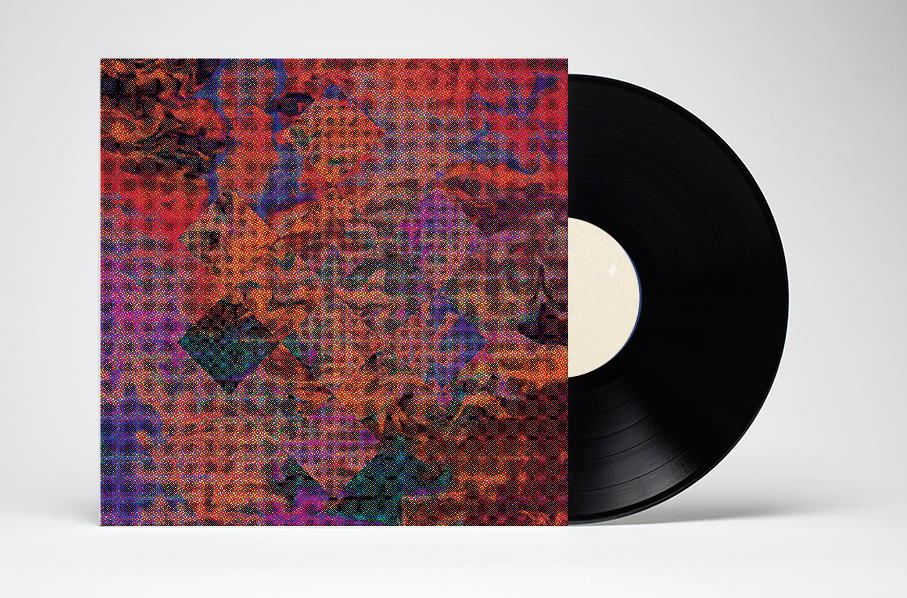
secret 7" final sleeve
massive attack - karmacoma
Eventually we decided on this final colour scheme which we both decided worked the best. I really like the edit Emily has done here because I feel it depicts the song well in terms of colour, I think visually its appealing with nice tones and shades but it doesn't look too garish or vibrant which is fitting for the song. I think the use of the endless knot karma symbol is subtle but works nicely emerged amongst the dream like pattern.
submission
Wednesday 26 February 2014
BRIEF 09: MEANTIME//REDESIGNING TO SUIT PRINTING//OUGD603
Redesigning
Originally before christmas 'Meantime' was one of the briefs I submitted to be fully complete, however when I went to print them I was completely disappointed with the printed version. I thought the stock was wrong, certain photographs were pixilated due to clipping masks and I wasn't happy with the back sleeve design. In terms of correcting the pixilation I decided to change the sleeve nets to 7" ones, this is because most of the photographs were taken on an old film camera and so the quality is effected when rescaling the image.
old prints

amendments:
In terms of editing the designs to fit appropriately for print, I decided to add a background colour for the nets as it looked too plain when printed the first time. Since coming back to the brief I have screen printed some tee shirts with the bands logo on. This is another thing I had to change, the original logo was made with scanned textured paper, which is impossible to get through screen printing. For the screen printed tee shirts the logo is in black, I then amended the sleeve designs so that it fit with the tee shirts, keeping the design more consistent.
screen prints

new designs: I thought the original design looked better at first, I thought the colour scheme fit more with the general designs of each sleeve, however as it wasn't vector based I found that this would be quite hard to transfer onto things, especially products like bags and tee shirts. In the end I also thought the black logo worked better amongst the range of sleeve designs.


Originally before christmas 'Meantime' was one of the briefs I submitted to be fully complete, however when I went to print them I was completely disappointed with the printed version. I thought the stock was wrong, certain photographs were pixilated due to clipping masks and I wasn't happy with the back sleeve design. In terms of correcting the pixilation I decided to change the sleeve nets to 7" ones, this is because most of the photographs were taken on an old film camera and so the quality is effected when rescaling the image.
old prints
amendments:
In terms of editing the designs to fit appropriately for print, I decided to add a background colour for the nets as it looked too plain when printed the first time. Since coming back to the brief I have screen printed some tee shirts with the bands logo on. This is another thing I had to change, the original logo was made with scanned textured paper, which is impossible to get through screen printing. For the screen printed tee shirts the logo is in black, I then amended the sleeve designs so that it fit with the tee shirts, keeping the design more consistent.
screen prints
new designs: I thought the original design looked better at first, I thought the colour scheme fit more with the general designs of each sleeve, however as it wasn't vector based I found that this would be quite hard to transfer onto things, especially products like bags and tee shirts. In the end I also thought the black logo worked better amongst the range of sleeve designs.
new nets:
These are the new nets designed to allow the sleeves to print without it being a problem, Im still slightly concerned about the 'blinded' sleeve as the quality of the main photo in this one is not as good as the rest even on screen, however when looking at it on screen in 'actual size' I think I might be able to get away with it.
I have also redesigned the back of the sleeves, they now look more consistent as a set of sleeves and also look less cluttered.
BRIEF 12: SECRET 7//DESIGN DEVELOPMENT//OUGD603
secret 7" development.
These were the final images that emily had edited, we needed to decide which colour scheme best fit with the song. Originally we decided on this one as we thought the colours depicted the song most successfully. However wen deciding on the final one we decided to change.


These were the final images that emily had edited, we needed to decide which colour scheme best fit with the song. Originally we decided on this one as we thought the colours depicted the song most successfully. However wen deciding on the final one we decided to change.
We were in agreement that the colours below were far too light and vibrant for the image we wanted to create, when listening to the song the visuals were not as bright and vivid as this, the individual colour palette didn't work.
We were leaning towards this one more because the colours complimented the song in that it was still psychedelic and visually interesting but the colours were more gloomy tones that suggested a more sinister feel to the song.
I had a go at contrasting the symbol of the endless knot, made from this coloured image, onto a black and white image of the pattern itself. Emily and I originally discussed putting the symbol, made from the patterned images, on top of a black and white photograph, however this looked too abstract and we couldn't decide on what the image would actually be in the background.
BRIEF 12: SECRET 7//DESIGN DEVELOPMENT//OUGD603
design development.
After gathering some visual and conceptual research and deciding on what kind of techniques we wanted to use to create the sleeve, we started the process. Our idea was to try and create a visual that depicted the effect of drugs, as it was supposedly written whilst both members were high on drugs, also this approach depicts the main hook of the lyrics 'karma coma, jamaica aroma.' However we also wanted to show the sinister feel for the song which would hopefully be shown through colours, and finally the image of the endless knot, cos we felt this theory was fitting with the song.
We started with a hand rendered approach and looked at scanning things in, objects that could be used as a collage or as a small part of an image. With the endless knot symbol in mind we both looked at ways we could use this image (or a simplified version)
This was my very first attempt, I didn't mind the overall design but I felt it didn't really depict the song in any way, being too abstract. My idea behind it was to try and show an abstract representation of the endless knot through collaged edited images with nice lighting and interesting visuals. However I don't think the concepts link is clear enough and you wouldn't be able to get the song purely based on the image of this sleeve.


 I also had a go at changing the pattern black and white to see if the sinister and gloomy feeling could be communicated more effectively. Although I don't think the image looks bad with these tones I don't think it says more about the song, I think the colours are important in allowing the sleeve to create the right atmosphere and although the black and white edit looks gloomy it doesn't reflect the song as well.

After gathering some visual and conceptual research and deciding on what kind of techniques we wanted to use to create the sleeve, we started the process. Our idea was to try and create a visual that depicted the effect of drugs, as it was supposedly written whilst both members were high on drugs, also this approach depicts the main hook of the lyrics 'karma coma, jamaica aroma.' However we also wanted to show the sinister feel for the song which would hopefully be shown through colours, and finally the image of the endless knot, cos we felt this theory was fitting with the song.
We started with a hand rendered approach and looked at scanning things in, objects that could be used as a collage or as a small part of an image. With the endless knot symbol in mind we both looked at ways we could use this image (or a simplified version)
This was my very first attempt, I didn't mind the overall design but I felt it didn't really depict the song in any way, being too abstract. My idea behind it was to try and show an abstract representation of the endless knot through collaged edited images with nice lighting and interesting visuals. However I don't think the concepts link is clear enough and you wouldn't be able to get the song purely based on the image of this sleeve.
This was my second attempt at trying to show the endless knot in a more obvious way, using interesting photographs of trees and skies, however I didn't like this attempt at all. I think its even further away from visually looking like the song and the design in general isn't very appealing.
Throughout this process I found myself getting stuck on how we could portray this song in the right way as visually we wanted it to look quite psychedelic but we still needed to include the concept of the endless knot somehow.
Emily was more successful with the process and used some mixed media pieces she had created to digitally manipulate on photoshop. I was focusing too much on photography and how an image could try and display the song, however a textured pattern would work a lot better.
The idea was to try and disguise the endless knot symbol into the pattern, Emily spent some time transforming the images so that the colour scheme was more appropriate for the song. At first we tried to cut the endless knot symbol out of the pattern, however we didn't feel the symbol looked too appealing on its own and this included a lot of white space which didn't particularly compliment the design.
Emily's edited version of the pattern worked much better as I feel the colours reflected the song more - psychedelic yet gloomy and kind of dark, this was the new image we were working with.
The idea developed into having the endless knot submerged in the pattern in a subtle way, which I thought worked quite nicely depicting the atmosphere of the song but also giving it a bit of context with the karma symbol displayed.
Once Emily had edited the colour scheme I played around with layout and how we could try and get the best visual image for the sleeve. I tried a few variations with different textured backgrounds because I thought this would compliment the textures from the edited image. Apart from a different take on the design it doesn't say anything that it hadn't said before.
Trying to add to the 'trippy' feel of the sleeve, the image has been taken and rotated put against the original, the symbol is still visible but not as clear.
BRIEF 09: MEANTIME//SCREEN PRINTING//OUGD603
screen print prep
To extend the brief a little further I have decided to screen print onto some tee shirts, the design will stay simple with the bands logo and the track listing for the current album.


To extend the brief a little further I have decided to screen print onto some tee shirts, the design will stay simple with the bands logo and the track listing for the current album.
As I have cleaned and coated my screen I decided to print out two testing pieces to ask whether the type was big and bold enough to actually come through when screen printing. I much prefer the design with the track listing on, however, I have never been hugely successful in the print room and so I'd rather have a design that works without the smaller text, than have a ruined design.
screen printing:
I decided after talking to Andy from the print room, that the possibility of there being a bleed in the thinner typeface wasn't worth the risk as the track listing is not essential on a tee shirt.
Tuesday 25 February 2014
BRIEF 12: SECRET 7//DESIGN SHEETS AND DEVELOPMENT//OUGD603
design development//design sheets
After looking at the song and discussing the video and other elements that we decided should be included to try and portray the song in the best possible way we did a few design sheets to get our final ideas down on paper and to see how a concept could be used successfully.
After researching we decided to go with the endless knot symbol as part of the design and concept as it seemed to link really well.
This was the symbol we decided on because it seemed to suit the atmosphere and lyrics of the song more so than other symbols that represented karma like the lotus: 'Lotus symbolically represents karma in many Asian traditions. A blooming lotus flower is one of the few flowers that simultaneously carries seeds inside itself while it blooms. Seed is symbolically seen as cause, the flower effect. Lotus is also considered as a reminder that one can grow, share good karma and remain unstained even in muddy circumstances.'
ways of displaying the endless knot in the design: detailed cross over links or simplified diamonds joined together as a more abstract representation.
TUTORIAL//BRIAN HINDMARCH//OUGD603
Tutorial with Brian:
I found this tutorial to be really helpful as Brian gave me some good references to help progress further with my work. We discussed my new brief 'the collected writings of Rosy Lee' which I needed some help with as I was stuck on layout and needed some help picking appropriate typefaces for the publication. We also discussed my unsung heroes poster and at some point will go over the arrangement to try and improve it.
notes from tutorial:
memory...proust! = disappearing history
your choice and appropriateness of type - i.e layout and arrangement for 'unsung heroes'
-could proof read and discuss 'visual syntax'
-i.e not only face choice but fine detail - editing, layout, punctuation and abbreviation
apollinaire: typography/calligraphy
ref. 'OnKarwa
'John Clare'
Ellen Lupton - thinking with type
type: Lucas Van der Groot - 'thesis' hybrids, superfonts - combination of serif and san serif
 Plan:
Plan:
After talking to Brain and looking at his suggestions, I feel this will help bring some new ideas and definitely some new inspiration for the two projects that we spoke about. I have looked up On Kawara, and I think he will be a really good source of inspiration for the 'unsung heroes' brief. As for my next step with the project, after progressing further with it I feel I want my final outcome to be focused more on type rather than image - and I also need to be careful of not designing something that looks a little too like a display of old photographs.
I found this tutorial to be really helpful as Brian gave me some good references to help progress further with my work. We discussed my new brief 'the collected writings of Rosy Lee' which I needed some help with as I was stuck on layout and needed some help picking appropriate typefaces for the publication. We also discussed my unsung heroes poster and at some point will go over the arrangement to try and improve it.
notes from tutorial:
memory...proust! = disappearing history
your choice and appropriateness of type - i.e layout and arrangement for 'unsung heroes'
-could proof read and discuss 'visual syntax'
-i.e not only face choice but fine detail - editing, layout, punctuation and abbreviation
apollinaire: typography/calligraphy
ref. 'OnKarwa
'John Clare'
Ellen Lupton - thinking with type
type: Lucas Van der Groot - 'thesis' hybrids, superfonts - combination of serif and san serif
After talking to Brain and looking at his suggestions, I feel this will help bring some new ideas and definitely some new inspiration for the two projects that we spoke about. I have looked up On Kawara, and I think he will be a really good source of inspiration for the 'unsung heroes' brief. As for my next step with the project, after progressing further with it I feel I want my final outcome to be focused more on type rather than image - and I also need to be careful of not designing something that looks a little too like a display of old photographs.
Monday 24 February 2014
BRIEF 12: SECRET 7//IDEAS AND INSPIRATION//VISUALS//OUGD603
visual inspiration:
This is some visual inspiration I have collected, we both looked at Dr.Me as some of their album sleeve designs were quite inspiring for this project, especially with the song we have chosen. Most of their designs consist of photo montages and collaging, a lot of layers and interesting photographs being distorted. Emily and I thought this would be an appropriate design style for the feel and lyrics of the song. We want to create some kind of visual that shows the atmosphere of the song, a sort of psychedelic vibe to support the lyrics 'jamaica aroma' however we must consider colour scheme and try to show a deeper level of understanding of the song through either symbols or text (that does not include lyrics or title for the song.)
dr.me: After discussing which direction to take in terms of design we both researched into visuals for some ideas, Emily looking more at the collage aspect whereas I focused on currently existing record sleeves. I really like this intricate pattern that forms the design of a Dutch Uncles record sleeve. I think its interesting visually and this kind of technique could contribute to our final design.


 lief podjasky, who i've used quite a lot this year for inspiration, especially with record sleeve inspiration. I am a big fan of his work and I think his portrayal of psychedelic patterns and imagery is one of the best I've seen. This is taken from work for an album sleeve.

This is some visual inspiration I have collected, we both looked at Dr.Me as some of their album sleeve designs were quite inspiring for this project, especially with the song we have chosen. Most of their designs consist of photo montages and collaging, a lot of layers and interesting photographs being distorted. Emily and I thought this would be an appropriate design style for the feel and lyrics of the song. We want to create some kind of visual that shows the atmosphere of the song, a sort of psychedelic vibe to support the lyrics 'jamaica aroma' however we must consider colour scheme and try to show a deeper level of understanding of the song through either symbols or text (that does not include lyrics or title for the song.)
I think the collaged pattern works well with the contrasting image as the background, the colour scheme is consistent. I feel when designing our sleeve colour will be an important aspect of being able to communicate the song in the best possible way.
Similar techniques that'll be considered, I really like the hand rendered, textured look some of these sleeves manage to convey. When extending the brief and printing it ourselves stock will be something to consider and whether textured stock would be appropriate/add to the design or whether an untextured matte stock would work better.
dr. me sleeve for dutch uncles, all of them seem to be made up of photographs and montages which I think works really.
This isn't something I would usually be drawn to, however with the song karmacoma in mind and also after being influenced by the video I think something like this could work. Its quite distorted an repetitive, almost looks as though its an endless pattern, which is a similar kind of vibe I got from the music video, repetition and being almost trapped in this confined area, (being the hotel corridor.) I like the complicated design and I think the colours add to the feel of it, which is something to think about when trying to create visuals for the sleeve.
This is one of my favourite designs i've looked at, I like the simplicity of it and really love the colour scheme and the textured effect the print has got. Although we can't use type in the one image based submission we will look to push the brief a little further and so this is something to consider. I wouldn't of gone for a serif font with this design, however I think it really works in this case, especially with the song title.
I think this kind of visual and colour scheme would depict the type of atmosphere the song gives. I am trying to step away slightly from the influence of the music video as I feel this could have to much impact on the overall design, it should really just be based on the song.
In terms of colour scheme I don't think its the kind of thing we are going for, however I do like the distorted scanned effect that has been used on the image. I think this is a technique we could attempt to try, depending on the image it could get the desired effect.
Subscribe to:
Posts (Atom)