presentation boards.
These are the final set of presentation boards handed in for the five briefs, brief 05 still needs finishing and I think some of my final products need to be printed due to pixilated images and choice of stock.
brief 08_spectrum (collaborative with emily)
brief 09_meantime
brief 05_unsung heroes and heroines
brief 06_interrail
brief 10_dr.me says make a flag (collaborative with steph)
Sunday, 22 December 2013
Friday, 13 December 2013
Thursday, 12 December 2013


Wednesday, 11 December 2013
BRIEF 08: SPECTRUM (PART ONE) //DESIGN DEVELOPMENT//OUGD603
development_reworked designs
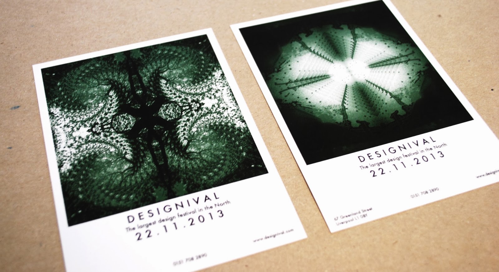
After looking at previous designs and deciding the colour scheme didn't work Emily edited the colours to make the series look more consistent. We discussed the idea of having a block colour for each poster (set of four.) These are two edited versions, with similar layouts. We decided the green worked better and that because the images and patterns created are strong enough all posters could be the same colour.


After looking at previous designs and deciding the colour scheme didn't work Emily edited the colours to make the series look more consistent. We discussed the idea of having a block colour for each poster (set of four.) These are two edited versions, with similar layouts. We decided the green worked better and that because the images and patterns created are strong enough all posters could be the same colour.


Three of four posters designed with the colour running consistently through, this was the first layout attempt with the new edited images, these new designs allow it to work more as set/series but still don't obviously communicate a design festival:

Experimentation on layout:
We decided the layouts without the boarder worked better but didn't communicate a design festival as well.
I felt changing the typeface for the design on the left was appropriate as the thinner, spaced out type face suited the white boarder. As the image is central with equal space on each boarder, we decided centrally aligning the text would work better with the layout.


Tuesday, 10 December 2013
BRIEF 08: SPECTRUM (PART ONE) // DESIGN DEVELOPMENT// OUGD603
type and image combined
After coming up with a few arrangements for the type we then decided to look at the edited images and the potential typefaces together.
This was the initial type design with the first image Emily edited, including three bits of important information, the address of the event, the website and the telephone number. Seeing it initially we decided we didn't particularly like them together, we didn't think it communicated a design festival very well.
 Again, we felt this didn't look right, it looked more suitable than the previous design but it still didn't fit the kind of message we were trying to communicate. With the combination of type, layout design and the specific image I felt it looked like it was promoting some kind of music festival.


 These designs all work better visually, however it still doesn't feel as though its obvious what the poster is for. We also needed to think about the consistency of the series, each image used is a different photo, colour scheme and editing technique, when placed together as a set would it be obvious that they were all for the same event if not for the text? I think its important to think about the design as a series as well.
These are variations of the text displayed differently and an attempt to change the layout to make it fit more with the event being promoted. I felt like the text in the centre of the image connotes the promotion of some kind of scientific themed event, its not something that obviously displays a design based festival. I think the title works better enlarged with a lower opacity, the message seems clearer, however the same problem still occurs.


After coming up with a few arrangements for the type we then decided to look at the edited images and the potential typefaces together.
This was the initial type design with the first image Emily edited, including three bits of important information, the address of the event, the website and the telephone number. Seeing it initially we decided we didn't particularly like them together, we didn't think it communicated a design festival very well.
This is the whole image with the text positioned, I think the layout of the three points of information at the bottom of the poster works, we didn't want too much text on the poster and so the vital information is laid out in a simple way. The layout for that information will still be considered in the design, at the moment we need to try and figure out what part of the image/type isn't working.
I think using lowercase helvetica and having the text placed over the image works a lot better than the initial set of designs. I think the white text looks good against the image background, although it still doesn't communicate a design festival.


These are variations of the text displayed differently and an attempt to change the layout to make it fit more with the event being promoted. I felt like the text in the centre of the image connotes the promotion of some kind of scientific themed event, its not something that obviously displays a design based festival. I think the title works better enlarged with a lower opacity, the message seems clearer, however the same problem still occurs.


I thought using certain sections of the original photograph to work as part of the visual for the text could suggest more of a design theme and look slightly more like the promotion of a design festival. I think this added to the design and made the typeface look slightly more interesting visually.

This is the second image that Emily edited for me to be able to look at potential layouts, I applied similar layouts as previously tested to see if the results would be more successful. Even though I prefer the designs of these sets of posters I feel it still doesn't communicate a design festival.


Another problem that Emily and I faced was the inconsistency within the series. Even if we had decided these designs worked well they didn't fit together as a series, the images all have the running theme of nature and natural resources to create the pattern/design however the photography and colours used are so different that its hard for them to keep a consistent style throughout, with the only consistency being the typeface/layout which isn't strong enough to allow the designs to work as a set.


BRIEF 05: UNSUNG HEROES AND HEROINES//PRESENTATION BOARDS SO FAR//OUGD603
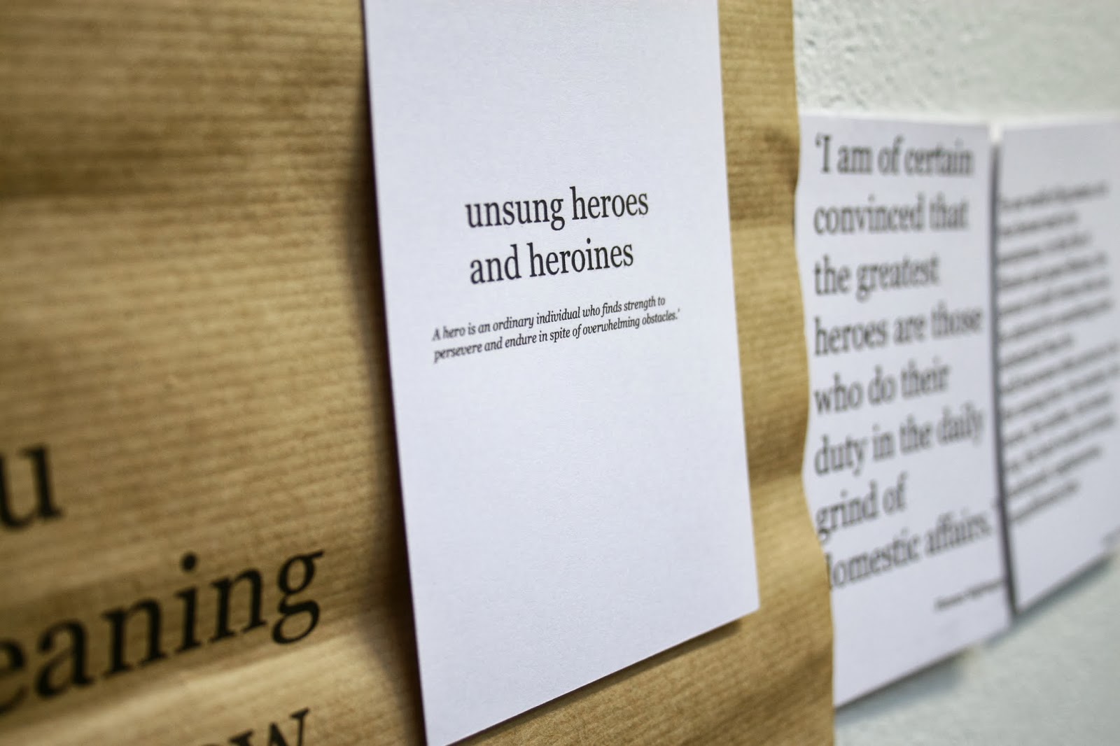
unsung heroes_presentation boards so far (incomplete)
These are the presentation boards for brief five so far, they include the brief, the concept and ideas/research and the development so far.
These are the presentation boards for brief five so far, they include the brief, the concept and ideas/research and the development so far.
BRIEF 05: UNSUNG HEROES AND HEROINES//DEVELOPMENT//OUGD603
unsung heroes and heroines_mock up
This is some printed material that I will use as part of the wall display for the brief, these are just some mock up photographs to get a better idea of what kind of thing I would like to produce for my final wall display.


Subscribe to:
Posts (Atom)