Saturday 30 November 2013

BRIEF 05: UNSUNG HEROES AND HEROINES//RESEARCH//OUGD603

research.
I have researched into Edyth's story and found a letter that gives an insight into the death of her son.  I thought this would work well for displaying the story in the best possible way, hearing from her, how she felt and what it was like.  I feel she had to deal with some tragedies, her mother died when she was young, her son died when he was young and her marriage failed because of the impact and strain it had on them.  I feel her letters give a real insight into what she was like and creates a poignant atmosphere that I think would be hard to try and create otherwise.

edyth and norman


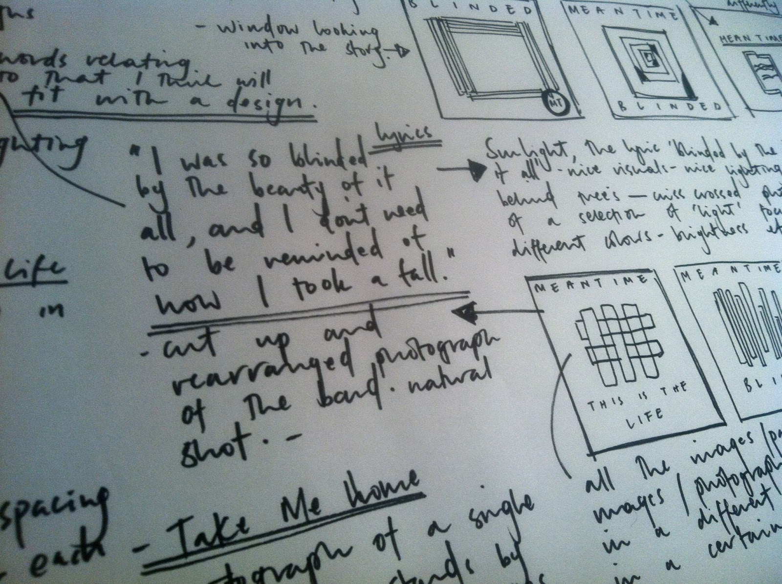
This is a photograph of Garth taken when he was younger, this is also a column torn out from a newspaper that was written for Garth after he died by my grandma, I feel as though this could also be used in the designs as nothing I can say will be able to set the tone as much as things that were actually said by people experiencing this.

The passage reads:
McQuade. - In everlasting memory of our beloved boy, Garth Carisbrooke McQuade, so tragically killed Sept. 1st, 1965.  "Every minute of every day, we remember him."
-Audrie, Nana, Grandad, Dennis
This is the last image of Garth taken, he sits in his new car, august 31st 1965.  On the 1st september 1965 he was killed in a road accident.
This is the letter sent from Edyth to my grandma after the death of Garth and the divorce to my grandmas brother, Norman.
Key parts of the letter:
'We all have our faults I guess, but look back Audrie -- have you ever heard me blame you at any time.  As I told you once before, Normie is your brother and that you see and believe only his side of the story is something I have always fully understood.  What was done took courage and a very good reason, which incidentally, whether you believe it or not, was not the reason you were given.  It has been a long, lonely pull and there have been many times when I have been very tired of life and to have joined Garth would have been no hardship.  We all need a reason for living and Garth was mine, without him there was little left.  I think I know just what you feel when you say 'Xmas will never be the same, ever.'  I exist but for me, life will never be the same, and I think you would find me a very different person to what you used to know.

I know what your children mean to you Audrie and I think perhaps you are one of the few people who realise just how much he did mean to me.  We were friends as well as mother and son, and it is only my many happy memories of him that makes his loss bearable.

However, life begins to be showing, somewhat hazy, but nevertheless a pattern, for peace of mind, and what I hope will be a little happiness maybe.

BRIEF 05: UNSUNG HEROES & HEROINES//RESEARCH//OUGD603

frames, diaries and photographs
I have collected a number of frames for the poster that I want to create, these are a selection of old photographs I found in my grandparents house which I will use for visuals throughout the project.  I also found some letters and a set of diaries written by grandma through the fifties, I thought the content in these could be used for some text on the posters depending on the subject and design.


have been doing some research into possessions, memories and photographs for the brief.  I am focusing on a story, an individuals story, a possible timeline or a small area in someones life.  I'm looking at the idea of everyone being an unsung hero to someone, with some exceptions.  I have chosen to look further on into the brief and focus on the memory of someone as well as a hero or heroine.  For some of the text in my poster I was going to use extracts taken from a general diary of my grandmas.  This gives context to her story, is quoted by her and adds an insight into her perception of life and things.
This is something that is a direct response to a previous ISTD brief which I have then extended further looking into the memory of someone.  The format choice of poster is purely based on the best way I think it could be displayed as opposed to a reason of promotion or advertisement.

‘The legacy of heroes is the memory of a great name and the inheritance of a great example.’ Benjamin Disraeli on heroes and heroism
‘There are two kinds of heroes. Heroes who shine in the face of great adversity, who perform an amazing feat in a difficult situation. And heroes who live among us, who do their work unceremoniously, unnoticed by many of us, but who make a difference in the lives of others.’ Susilo Bambang Yudhoyono President of Indonesia
‘I am of certain convinced that the greatest heroes are those who do their duty in the daily grind of domestic affairs.’
Florence Nightingale
I have been investigating into past family stories and memories, looking through old letters.  This is one sent to my aunty, uncle and dad from their aunt in 1971.  I think even though the general written passages don't focus on much in particular apart from a general letter sent before the new year it gives an interesting insight into what was happening, if this is a story based on her the most poignant information would be from her.  There is definitely something about the way letters were written when there was no such thing as emailing, the style and language flows in a way that would not be quite the same in modern day.
telegram:


letter:

Friday 29 November 2013

BRIEF 09:MEANTIME//FINAL RECORD DESIGNS//OUGD603

designs.
These are the four final designs for the record sleeves, three singles and one album

meantime album

singles

blinded
this is the life
take me home

sleeve one
meantime
sleeve two
blinded
sleeve three
this is the life
sleeve four
take me home

front and back of sleeve


Thursday 28 November 2013

BRIEF 09:MEANTIME//RECORD NETS AND FINAL DESIGN//OUGD603

record nets.
These are the final designs and a net for the sleeve for after printing.


Wednesday 27 November 2013

BRIEF 09:MEANTIME//DESIGN DEVELOPMENT/BACK OF SLEEVES//OUGD603

designing back of sleeves.
I chose to include the lyrics on the back of the album sleeve because I think it adds to the design.  Positioning the text was quite hard because of the amount of lyrics to work with, I didn't want the back of the album to become too busy or over crowded with text.  I chose to keep consistent with the text and use the same as I had been using for the bands logo.

I started with the back of the album track list.  I wanted the text to be in capitals because I think this works better with the font I have selected.  This is the basic design for the back of the album, with two sides to the record.  I thought this looked quite plain and would definitely be decided on what stock I chose.  

I originally wanted to use an off white textured stock but I think with the colours in the photographs this wouldn't work so well.
The original idea was to add colour like this, which is matched with the logos stock colour.  The colour would gradually fade in opacity and the bands logo in the right bottom hand corner.  I think this is an improvement from no colour but this would also rely on what stock was used.
This is where I incorporated the cut up strips of stock and layered them against each other for the background of the track listing, I thought this worked well with the block strip of colour at the top with the bands name.  The layered strips are also in keeping with the cut up collage style I have used throughout the design of the sleeves.  This is the final design for the back of the record, excluding the band logo.
blinded back sleeve
When starting to design the three single back sleeves, I was firstly going to lay out the lyrics really simply with no imagery.  I started looking at ways I could lay the lyrics out without looking too busy.  I firstly tried laying them out aligned all to the left, however I thought the sleeve looked too text heavy on one side of the sleeve.  I then positioned it into three different columns.
I rearranged the layout and added the bands logo, which I thought worked better, however I thought there was too much white space and the choice of text didn't really work.  For the lyrics on the back of the sleeves, I first tried to use the same font as I had been throughout the design but in italics, I didn't really think this worked as well, it didn't seem to match the design. 

For my final design of the back of the blinded record I decided to go with something similar to the first back sleeve design, using photographs that I had used to design the front of the sleeve for.  I also decided the lyrics looked better in the same font but smaller.  This is the final design for the back of the sleeve for the single 'blinded.'
take me home back sleeve
The 'take me home' back sleeve followed a similar design for the first two, without the collage style.   I used the same photograph I had used on the front, the band logo is still positioned in the same place throughout the designs.  This is the final design for the back sleeve, in terms of positioning the image I thought it worked better being aligned to the left in line with the text rather than centrally.
this is the life back sleeve
This is the design for the 'this is the life' single, this uses the same photograph from the front of the sleeve but as one image instead of a collage.  For the final design I decided to go with the single photograph instead of the second part of the photograph at the bottom, I think the image used at the top looks good as a similar image because its quite abstract and interesting.  The text for the lyrics appear in capitals on all the designs separated into three columns.

This is the final design for the last sleeve, I think it looks more consistent as a set if I only have one strip of the image rather than two. 

Tuesday 26 November 2013

BRIEF 09:MEANTIME//DESIGN DEVELOPMENT/SLEEVE 4//OUGD603

development.
meantime 
This is the design for the record, the overall album.  I think in all three single designs and this design our consistent in terms of style, all photography based, collage, pattern and logo.  The album front cover doesn't have a concept behind the design, I just thought the image suited the style of the band and that visually it was interesting enough to use.  This was a photo taken on a similar camera to the previous photos of the band.

I started looking at light images again as I had used these throughout the design of the sleeves, these were two images that I thought could be used.  When scanning them in I experimented with the scanning outcomes which I thought made the image look more interesting and fitting with the sound and style of the group.


I decided to go with the image on the right as I thought it was stronger and more consistent with the other type of photographs I had used in the other sleeve designs.  I did a similar thing to what I did with the 'This is the life' design where I cut the image up and pieced it back together.  I also added the logo to the image which I thought fit quite well because of the similarity in colours.

This is the final image for the record.

Monday 25 November 2013

BRIEF 09:MEANTIME//DESIGN DEVELOPMENT/SLEEVE THREE//OUGD603

development.
Take Me Home - this is the third single from the record, my idea is really obvious.  I have used an image that I have taken which I think works well for the song, its image is of a deserted landscape sunset where one window from a faded house is visible, by itself.  That is the image of home in this track.

Originally I wanted to create some abstract patterns with the sky in a different image but I dont think it displayed the song well enough.
This is the image I decided to go with for the song.  I copied the image and rotated it a few times creating a bit of a pattern, I think the subtlety of the unchanged image in the middle makes the change to the photograph less obvious.

BRIEF 08: SPECTRUM (COLLABORATIVE) //CONTACTING//OUGD603

When gathering visuals and images we looked at Leif Podhajsky as a source of inspiration, I have really admired his prints and style of work since second year and we both wanted to create something that visually reflected his kind of style, in our version.  


contacting Leif.
Whilst research Leif Podhajsky we realised he was based in London and thought it would be a good opportunity to contact him and try to arrange a studio visit where we could hopefully go in and show him the work that we've been producing.

When we first started working on the brief we looked at how we could incorporate the theme of nature, this is another reason why Podhajsky was a really good source of inspiration:

about leif.
Leif is an artist and Creative Director. His work explores themes of connectedness, the relevance of nature and the psychedelic experience. By utilizing these subjects he attempts to inspire the viewer into a realignment with themselves and their surroundings.

'Come dip your toes into the psychedelic stream of Leif Padhajsky’s imagination for some striking abstractions of nature – mirrored vistas, engulfing waves, rippling, melting cosmic landscapes. Some of these kaleidoscopic images will also be instantly familiar having graced the covers of albums for the likes of Lykke Li and Tame Impala.'
Leif Podhajsky dazed interview, 2011.

We speak to the Australian artist about his ethereal artworks for the likes of Tame Impala and Lykke Li

Connecting visual streams between the forces of nature, psychedelia and altered realities, newly Berlin-based Leif Podhajsky has been commissioned to create his ethereal artworks for the likes of Tame Impala and Lykke Li, to The Vines. His stunning and surreal blog, VISUAL MELT collates his inspirations from lush wavey-witchy electronic music to influential artworks, often tipping into the world of the occult and mysticism.
Dazed Digital: How would you describe the art that you make?
Leif Podhajsky: I create work that explores themes of connectedness, the relevance of nature and the psychedelic or altered experience and by utilizing these subjects I am attempting to coerce the viewer into a realignment with themselves and their surroundings. In a lot of my work I am pursuing a symbiosis between digital techniques and organic feeling outcomes. My artwork is really an exploration of creativity and imagination with the intent in finding answers to my own life and the things I sense and feel but can't explain in words.
DD: Where do you draw your inspirations for the ethereal and psychedelic themes from?
Leif Podhajsky: 
From nature, from music, in harmony, balance, knowledge, wisdom and love. I draw on these elements and try and be as open as I can be and appreciate every moment as special. When I am making something and locked in that zone of creative freedom is when I am most happy and amazed to be alive and where I gain most inspiration from.
DD: Are there any artists/photographers whose work you find particularly inspiring?
Leif Podhajsky: All the artists and musicians that I feature on my blog VISUAL MELT mean a lot to me, artists like Remedios Varo, Caspar David Friedrich, Bas Jan Ader, Yves Klein, Michael Cina, Neil Krug, Jonathan Zawada, Young Magic, Schiele, to name a few.
Sometimes I get so overwhelmed by the amount of great artists and artwork that I like to remove myself somewhat from seeing or hearing to many things. I believe this allows me to develop my own style naturally and focus on what I want to create without distractions. Its especially true in this digital age with endless amounts of inspiration at our fingertips.
DD: Why have chosen to collaborate with musicians by designing cover artwork?
Leif Podhajsky: Music plays a big part in how I create, not just for record labels or bands but across everything I do. I find it helps me turn the part of my brain that over analyses and makes things logical switch off. This helps as it lets me form compositions in a more natural and fluid way. So it felt really organic to begin creating artwork for musicians, I have always loved album art and think it can really add to the whole experience of an album.

DD: Do you try to accompany your style with the music on the record?
Leif Podhajsky: Yes I definitely listen to the music and create something that harnesses its essence whilst still keeping my own sense of style. For example I just did some pieces for Shabazz Palaces and I must have listened to their album 15 times through from start to finish whilst developing and creating the artwork. As I mention above music plays a key role in how I create and I love making artwork for musicians, creating visual identities for musical journeys.
DD: What are you working on now/most excited about next?
Leif Podhajsky: I have just moved to Berlin so I am very excited to be in a new city which is so full of creative energy. I am also looking forward to making some sculptural pieces and diving into some more motion work too. More of everything please.

Sunday 24 November 2013

BRIEF 09:MEANTIME//DESIGN DEVELOPMENT/SLEEVE TWO//OUGD603

development.
song - this is the life
This is the starting song on the record.  I decided to use photographs of the band, as a sort of introduction, photos capturing them.  I basically wanted to create a photomontage pattern depicting the band in a causal social situation. The images really help the design as the colours in the prints are nice and interesting.
The idea was to use two photographs and combine them together to make a layered pattern of the group.  Adding the song title into the image.  I firstly tried adding the logo for the band but didnt think the circle logo worked with the square pattern, I then layered the logo underneath the photo.

BRIEF 08: SPECTRUM (COLLABORATIVE) //PLANNING//OUGD603

spectrum planning:
Today Emily and I had a chat and planned out what printing techniques we were going to try and what materials we would need.  visually we have ideas of how we want it to look but after we have tried a few different processes and printing techniques it'll be easier to judge what direction the design is going in and we'll then discuss how we will push it further and alter/edit or extend on the prints.

materials.

  • salt
  • watercolours
  • white spirit
  • paper
  • wax crayons
  • hair dryer
  • plastic cutlery
  • screen printing equipment (college)
  • tissue paper
  • PVA glue
  • old cloth/material (tie dye)
  • dyes
  • coloured inks
  • glass paints
  • shaving foam
experimentation and processes.
  • digitally enhance through illustrator and photoshop
  • tie-dye 
  • screen printing 
  • mixed media
timetable/schedule.
thursday: planning/prepping/organising

monday-wednesday: half days of printing and experiments, trying out processes

Saturday 23 November 2013

BRIEF 09:MEANTIME//DEVELOPING DESIGNS/SLEEVE ONE//OUGD603

development
I wanted to focus mostly on photography and photomontage for the designs of these record sleeves.  I think the designs subtly say something about the song title, I didn't want to create a really obvious design for the track title, I felt using photography could display suggestive, abstract images about the songs that hopefully compliment the lyrics.  The brief was to design four record sleeves for three singles and an album for Meantime.

My first design is a song called 'Blinded.'  'I was so blinded by the beauty of it all, and I don't need to be reminded of how I took a fall.'  This was the line I took to try and create an image for the sleeve.

I first decided on a way to display the band name, a logo.  I wanted something simple and not massively distracting or busy as my designs for the record sleeve would be quite abstract and so the logo should be less distracting.  I firstly decided to have the name meantime in simple italics with generous spacing:
I decided it might look better adding a scanned in texture to add to the logo, I decided a circle could work nicely on record sleeves.  I thought this worked better for the band and the images on the album sleeves that I plan to use. 


blinded.
'I was so blinded by the beauty of it all, and I don't need to be reminded of how I took a fall...'
For this album cover I wanted to look at lighting in photography, a simple link with the song name, blinded.  I think that significant line of the lyrics suggests soft lighting, the word beauty lightens the image I have when I hear the song.

original photograph:
This was the main image I wanted to use for this album sleeve.  This would be the main focus, I would then use other images with either similar or contrasting light visuals and photomontage them to make some kind of abstract collage.
I used another photograph I had taken out of my window with the reflection of lit up windows against the glass, this created some nice light and colours which I thought would contrast well with the lighter, softer tones of the first image.  Cutting these into strips for photomontages on the album cover, it also makes the image slightly more abstract which is what I wanted for these album visuals.
This is the final image I want to use in this montage, I chose it again because of the lighting and the contrast of lighting within each image.  I have reworked the final image of sun light beaming through trees with the image above to create a weaved pattern as part of the design.
Part of the design with the logo incorporated
I thought placing the text looked better in the logo rather than underneath the image, I feel like the logo can be consistent throughout the four album sleeves which is why I decided to go with the above design.  Below is the final image for the sleeve, without the logo placed in the right hand corner.  I think the image has worked well with the song title, still being quite abstract.  I now need to create the nets for the range of sleeves.

Friday 22 November 2013

BRIEF 09: MEANTIME//DESIGN DEVELOPMENT/DESIGN SHEETS//OUGD603

meantime_initial thoughts and ideas
What I mainly want to focus on when designing these cover sleeves is looking at how I can best use photography to try and image the lyrics in the song.  Photographs and collage are the techniques I want to try and use throughout all the sleeves.

To get some visual ideas I listed what came to mind with each song title in a way where I could use photography: Blinded: lights, sun light, natural lighting, eyes, hazy.  Take Me Home: houses, home, street.  This Is The Life: depicting life in some way, natural photograph.  These were just quick word associations for first thoughts.
For the Blinded cover I wanted to look into lighting, this was the first thing I thought would best display the song as the lyric reads 'I was so blinded by the beauty of it all, and I don't need to be reminded of how I took a fall.'  I want to collect some photographs that I have taken that in different ways show different light, contrast in colour, sharpness etc. montaged together to create another image
Selecting photographs that I have taken and scanning them in and either distorting them or manipulating them.  The idea for all three sleeves is to use photographs that in some subtle way depict some of the lyrics in the song, cut up and rearranged in a different pattern creating new colour and texture. 
I needed to create either a logo that could go across all of the sleeves or choose a consistent typeface for the band name.  I wanted the name to be in capitals and to be generously spaced between each letter with a simple typeface.  I feel with a simpler typeface/logo there is more room to do something with each individual sleeve design. 
With the back of the sleeve design for each individual song I wanted to include the lyrics as they help sum up the design better.  On the Meantime record it will just have the track listing on the back.  Each sleeve back will have the Meantime logo in the corner.