After trying out my original idea for the logo and not being entirely happy with the outcome I then had to think of some new ideas/concepts for the branding of the Drinks club. It was discussed with the client (who wants the branding for personal reasons more than anything) looking at this humorous approach to the branding and tying it in with this idea of 'the philosophy of drinking.' I came up with the idea after the client mentioned he wouldn't mind the branding being taken in a a light hearted way.
I then looked at how I could incorporate this idea of the 'philosophy of drinking' into the branding and began looking up famous philosophical quotes that could be linked to drinking alcohol etc.
visual ideas: I thought about having the whole branding as quite clean and simple, traditional typefaces, cream stock, text heavy, including philosophical quotes etc. or possibly link to literature and poetry (drinking) as I feel this could collect some humorous sayings. An idea for the simple logo would be the door number the drinks club is located, 170.
tag line: philosophical drinking since 1978, products to consider making: membership card, drinks menu/drinks club etiquette booklet? drinks label, drinks bottle wrap, plaque, coasters.
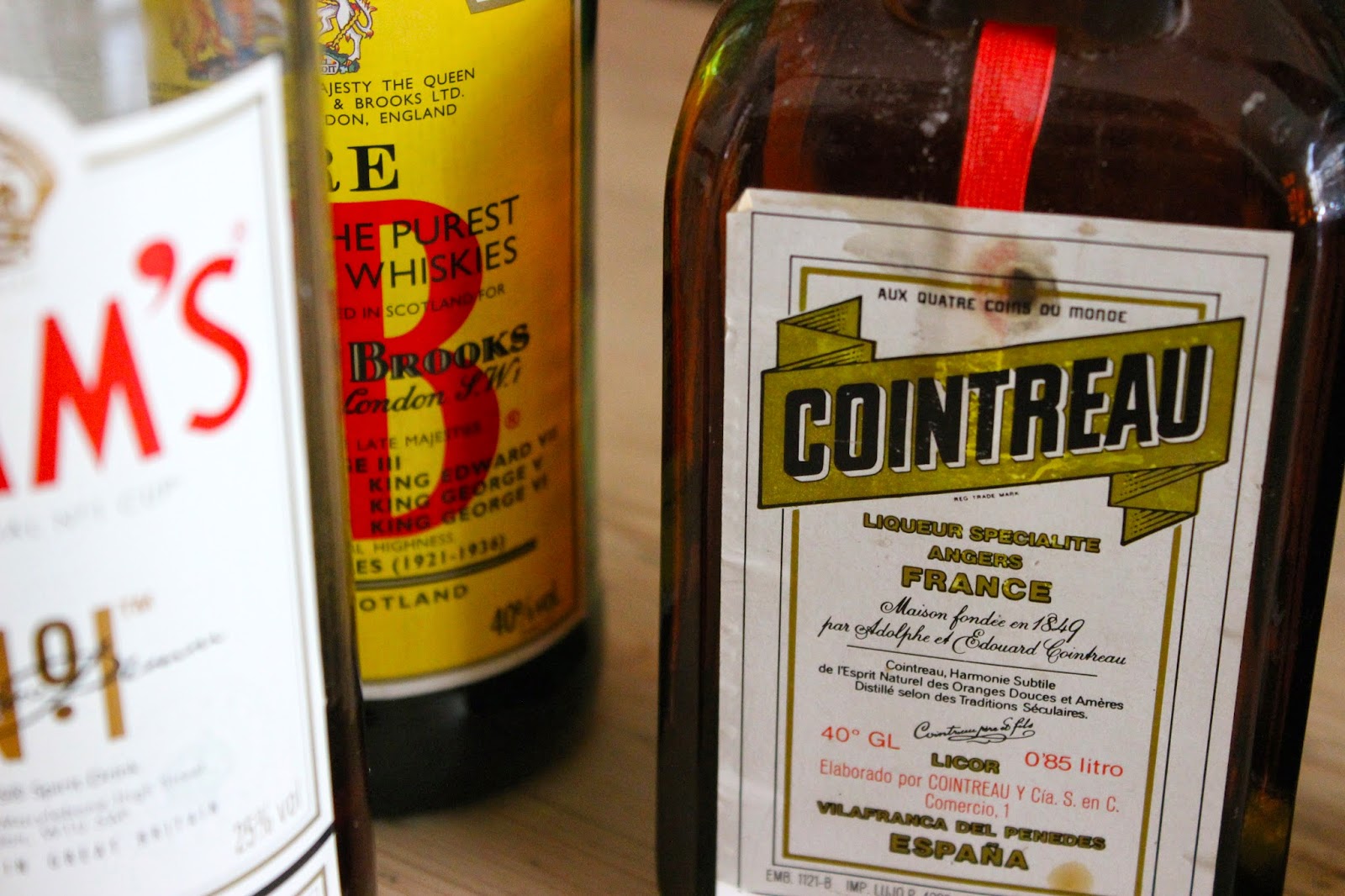
I then looked at alcohol labels that I particularly liked the design of for some layout ideas and general inspiration. One of my particular favourites is the Pimms label design. I think the logo design is clean and simple but has a classic feel about it, I feel the colours compliment each other nicely and there is a nice combination of types. Something to consider when printing would be foiling as I think this could make a nice finishing touch depending on the direction the branding takes, but possibly gold or bronze foiling for the logo or part of the written passage on the label.
The idea of having a signature (which I feel most big brands of alcohol do) was quite appealing to me as I thought of choosing a particular philosophers signature, almost as if the drinks club gets the seal of approval. I also like the label being split into two parts, the second part being type based.
Cointreau's label has something visually interesting about it, quite old fashioned, the logo isn't something I particularly love but I think it works really well with the overall label design. I like the layout of the label and that its quite text heavy, which is something I want to consider when designing the drinks club wine label.


No comments:
Post a Comment