Working on COP allowed me to research into theories and history that I would of never really looked at or thought I would of been interested in. Whilst researching the history and the development of the London Underground I ended up looking into the industrial revolution and key figures such as William Morris and John Ruskin. Since the COP module I have been increasingly interested in William Morris's beliefs and values which is why I wanted to incorporate it into my personal manifesto. Whilst visiting a print shop in Walthamstow village (waltham forest is the birth place of William Morris) I came across a poster with a quote by Morris that I really liked and which I thought could sum up my manifestos final quote perfectly, combining life and work as one.
'give me love and work - these two only.' - William Morris
Something that I've wanted to do whilst being on the course is try and create visual and interesting patterns similar to that of Lief Podjaski etc. This was someone I looked at when Emily and I collaborated in both Spectrum and Secret 7". I liked this style of working and the visuals produced and so wanted to work this way for the back drop of the quote.
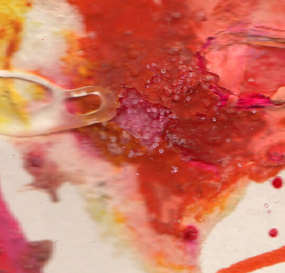
I started off using inks, bleach and salt to try and create areas of interesting pattern. Once it had settled and dried the effects turned out to be more interesting and scanning them in and editing certain areas could be interested when manipulated on photoshop.
original:
After manipulating on photoshop and looking at various distortion effects and colour saturations and vibrancies, I found a pattern that I liked that I thought would work well against the quote.
examples of manipulation and colour change:
I cropped various areas of the design that I thought were interesting and zoomed in
This is the final background I want to use, after manipulating various areas of the original mixed media, scanned in etc. I think these colours will look quite nice against a white serif typeface. Im thinking of using the typeface that Im using for my self branding as I feel this is quite a significant piece in the manifesto and in my branding.
poster layout development:
I did originally try with a couple of other typefaces but I feel from the the beginning Minion Pro (the typeface I've been using for my own self branding) worked the best. To match the branding I have kept the kerning and it is consistently in capitals as I think the typeface suits this better.
layouts:
These were the two initial layout ideas I had, just placing the text simply in the centre of the poster. I also included William Morris and is birth to death date, also including the many talents he had, philosopher, artists, designer and poet. The left layout, that included all directly underneath the text, whereas the layout on the right has that information placed at the bottom. In terms of legibility and which one allows the quote to stand out more, the left is more successful, however I personally prefer the design on the right.
Similar layouts to the two above, typeface enlarged on the left, body copy moved to directly below the quoteI quite like the idea of thick outlined box, however I don't want the poster to look too much like a post card which I think the one on the left does resemble, I also don't think the typeface being that point size works with the boarder. I like the one on the right because I think the square around the words 'love and work' reads well as separate and also when excluding the part of the quote that is enclosed in the box the rest of the quote still reads and makes sense, 'give me these two only.'
I also rotated the background on these two layouts which I actually think works better as the movement within the poster is working downwards and so I think it being rotated allows the pattern on the poster to flow better and also allows for the text to sit better on the page.


No comments:
Post a Comment