I wanted the layout of this publication to be simple, I didn't want anything distracting from the single image and the type. Each image would relate to the passage written in some way, linked through a memory or a visual image for the written passage. I wanted quite a wide margin to give more white space.
Essentially what I've been doing with the footers of the right page is mapping, addresses/locations and the time. This gives the image a bit more context in terms of factual information about the visual, the quote allows for the image to be read with more understanding
I want to keep the style and layout of this publication simple with a lot of white space as I feel this would be the best arrangement for the imagery. I am struggling with the positioning of the images on each page, and whether to keep the layout of the images on the left hand side consistent the whole way through or dot them randomly around each page according to that specific spread.
Some pages also vary as it could be one teabag image or two made up to form one image. This spread has two reference points, using two visuals from the passage, however because theres such a contrast I don't know whether to exclude the smaller photo as it doesn't seem to fit with the rest of the page.
I thought the serif fonts were quite appropriate for the aesthetic of the publication, the style of photography etc. The basic layout is simple which is what I think works best as an over complicated layout could take away from the images.
cover: For the front cover I don't want to include an image on the front page as I feel I couldn't pick one that would be appropriate to sum up the publication with a specific image, I also think it gives the content of the book away if being able to see one of the images on the cover. I would like to have the cover in different stock, possibly brown parchment card with a sleeve over the top. Another consideration was whether to include the meaning of Rosy Lee on the front cover, I think it would probably work better being in the title page:
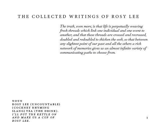
This will be the opening page of the publication, including the title and the definition of 'rosy lee' (to give the book/title context) I then added a quote by Marcel Proust that touches on 'memory' and the past which links well with the idea of the book, looking at memories and past events.
Now that I have printed the 'Tea in Paris' booklet I would quite like this publication to be printed in a similar way as I feel this would allow design consistency and also work well as a collection.


No comments:
Post a Comment