The main idea behind the poster design was to use a photograph from the display as a way of giving an insight into what the exhibition would be about. The best image for this is a photograph of a collection of old diaries from the fifties.
passage on poster
A collection of journeys that celebrates the untold stories of unsung heroes and heroines.
Quotes about unsung heroes and heroines, relevant information about the exhibition, date, time, venue etc.
I decided to use the typeface Georgia as this was the same font I used for the postcards in the wall display. I think a serif font displays a more old fashioned classic style type as opposed to a more modern sans serif, this would be fitting as the brief has been directed with a historical underline. Most of the image is white space/wall space to allow for relevant information about the exhibition. Exhibition name: Unsung heroes and heroines. I firstly tried displaying all the information at the top of the poster underneath the exhibition title, however the arrangement of type didn't really work.
Vital information that should be focused on when designing the poster:
- exhibition name
- location
- time and dates
- contact information/website
Testing typeface/ text colour and layout. This layout places all the text at the top of the poster, above the image of the diaries, although I think the arrangement of text doesn't quite work and all the vital information isn't included.
Same typeface, I think the white text works better as the image stands, however the arrangement doesn't work as well, also with the exhibition name being that large the possibility of having the vital information at the bottom of the poster could work.
Information about exhibition placed at the bottom of the poster, I think the white text stands out against the darker areas of the poster, however I still don't think the text works in terms of layout.
including images/boarders
Even though the postcards used in the wall display all used the typeface Georgia, I have looked at other possible typefaces and I think one that worksjust as well is Gill Sans. In terms of a typeface suiting the subject matter I would go with Georgia, however, in this case I think the sans serif type works just as well, it'll just depend on whether it will look inconsistent when put together with photos from the wall display.
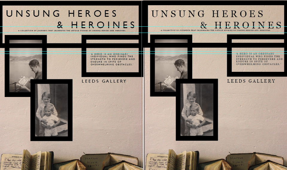
Once I had included the idea of a thick lined boarder around the exhibition name I started looking at how I could incorporate other photographs in the poster to possibly give a bit more away about the exhibition, if the combination doesn't work then I will keep the original design as a poster and use the new idea as a promotional flyer. This has given me a potential idea for another poster, similar concept, using the back drop of a clear white/cream wall and then layering a number of photographs with black boarders to make it look as though its a wall display.
This is a developing poster idea, when adding more framed photographs it could potentially make the poster look too busy. This is the same design with the two different typefaces, I feel both can work but will look to see which one is more suited when the general design becomes more developed.
After experimenting with the first idea on top of the image of the diaries I thought that it would be beneficial for both designs if they were two separate posters. The backdrop will still stay the same, a cream wall, with the thick lined boarded photographs. I have put a quote about unsung heroes/heroines in one of the boarders which could be potentially put into clear space on the poster rather than bordered.
Positioning text: It was important to place the text with the important information about the exhibition somewhere obvious and clear. Putting the text in a framed photo is a potential idea if there is no clear space left. Cream typeface works better as it matches the background of the poster however the white is more legible.The text works better in a clear space as opposed to layered over a photograph, presented a lot clearer.
choosing images:
Testing the poster with various photographs, I thought about using the colour photo as this is specific to the story that was being focused on in the first part of the brief. The colour photograph is the last photo taken of Garth McQuade before he died two days later, which is the son of Edyth McQuade - the person who was the starting point for the brief as the unsung heroine.
However, I think when put with the other black and white images it looks a bit out of place and doesn't quite work as well. All the images will be black and white on the final poster, and the quote has been moved from the board as composition works better this way.
first poster development:
I've decided to change the typeface on the promotional material to Gill Sans as I think it suits the design of the posters better. I have changed the layout of the original design for the initial poster. After playing around with where the type could go I experimented with the photographs of the diaries being rotated 90 degrees which I think worked quite well as it makes it look like a stack of journals which is suitable for the exhibition content.
These are the final three variations of the poster, I think all three of them could work. They all have different quotes so using two could be a possibility. I think the one on the far right probably works the best, I like the contrast of the white typeface against the dark area of the photograph.


No comments:
Post a Comment