presentation boards.
These are the final set of presentation boards handed in for the five briefs, brief 05 still needs finishing and I think some of my final products need to be printed due to pixilated images and choice of stock.
brief 08_spectrum (collaborative with emily)
brief 09_meantime
brief 05_unsung heroes and heroines
brief 06_interrail
brief 10_dr.me says make a flag (collaborative with steph)
Sunday, 22 December 2013
Friday, 13 December 2013
Thursday, 12 December 2013


Wednesday, 11 December 2013
BRIEF 08: SPECTRUM (PART ONE) //DESIGN DEVELOPMENT//OUGD603
development_reworked designs
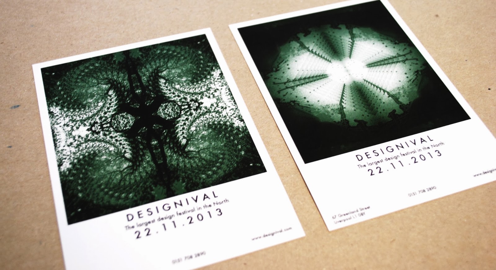
After looking at previous designs and deciding the colour scheme didn't work Emily edited the colours to make the series look more consistent. We discussed the idea of having a block colour for each poster (set of four.) These are two edited versions, with similar layouts. We decided the green worked better and that because the images and patterns created are strong enough all posters could be the same colour.


After looking at previous designs and deciding the colour scheme didn't work Emily edited the colours to make the series look more consistent. We discussed the idea of having a block colour for each poster (set of four.) These are two edited versions, with similar layouts. We decided the green worked better and that because the images and patterns created are strong enough all posters could be the same colour.


Three of four posters designed with the colour running consistently through, this was the first layout attempt with the new edited images, these new designs allow it to work more as set/series but still don't obviously communicate a design festival:

Experimentation on layout:
We decided the layouts without the boarder worked better but didn't communicate a design festival as well.
I felt changing the typeface for the design on the left was appropriate as the thinner, spaced out type face suited the white boarder. As the image is central with equal space on each boarder, we decided centrally aligning the text would work better with the layout.


Subscribe to:
Posts (Atom)