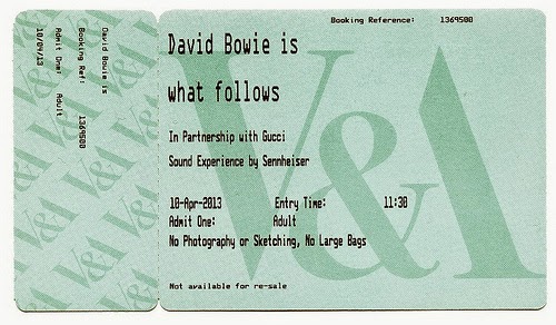
I thought that to give some context to my work and to allow the publication to be more realistic I created some museum exhibition ticket designs. I think this just allows the brief to have more context and when photographed will add to the overall images. I looked at examples of other exhibition tickets, especially those from the V&A to see how they were laid out to try and make mine look as realistic as possible.
development:
I wanted to keep the design simple and in keeping with the publication design for consistency. All important and relevant information about the exhibition features on the ticket, after looking at other tickets and highlighting what need to be on and what isn't necessary. When first designing the ticket I wanted to include a visual and thought using a frame could be quite nice depending on positioning, however I thought for the ticket design the simper the more realistic and as I wanted to create a belly band for the publication featuring the set of frames I eventually decided against any visual.
mock ups and feedback:
I printed out some mock ups to look at scale and the layout generally and see what needed to be improved, it was really helpful to receive some feedback from peers which I took into account to help improve my design. I looked at the arrangement of type and considered feedback I'd been given which was really helpful and also suggested some ideas to improve the design that I could consider if I had enough time.
I was told to consider whether any more information would be necessary on the ticket and that perforation would add to the design and make it more realistic. Another suggestion was to foil the title exhibition in gold, I thought this could look quite nice and fit with the content of the publication as there is a lot of gold frames used for visuals.


No comments:
Post a Comment