I chose to include the lyrics on the back of the album sleeve because I think it adds to the design. Positioning the text was quite hard because of the amount of lyrics to work with, I didn't want the back of the album to become too busy or over crowded with text. I chose to keep consistent with the text and use the same as I had been using for the bands logo.
I started with the back of the album track list. I wanted the text to be in capitals because I think this works better with the font I have selected. This is the basic design for the back of the album, with two sides to the record. I thought this looked quite plain and would definitely be decided on what stock I chose.
I originally wanted to use an off white textured stock but I think with the colours in the photographs this wouldn't work so well.
The original idea was to add colour like this, which is matched with the logos stock colour. The colour would gradually fade in opacity and the bands logo in the right bottom hand corner. I think this is an improvement from no colour but this would also rely on what stock was used.
This is where I incorporated the cut up strips of stock and layered them against each other for the background of the track listing, I thought this worked well with the block strip of colour at the top with the bands name. The layered strips are also in keeping with the cut up collage style I have used throughout the design of the sleeves. This is the final design for the back of the record, excluding the band logo.
blinded back sleeve
When starting to design the three single back sleeves, I was firstly going to lay out the lyrics really simply with no imagery. I started looking at ways I could lay the lyrics out without looking too busy. I firstly tried laying them out aligned all to the left, however I thought the sleeve looked too text heavy on one side of the sleeve. I then positioned it into three different columns.
I rearranged the layout and added the bands logo, which I thought worked better, however I thought there was too much white space and the choice of text didn't really work. For the lyrics on the back of the sleeves, I first tried to use the same font as I had been throughout the design but in italics, I didn't really think this worked as well, it didn't seem to match the design. For my final design of the back of the blinded record I decided to go with something similar to the first back sleeve design, using photographs that I had used to design the front of the sleeve for. I also decided the lyrics looked better in the same font but smaller. This is the final design for the back of the sleeve for the single 'blinded.'
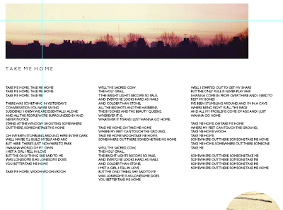
take me home back sleeve
The 'take me home' back sleeve followed a similar design for the first two, without the collage style. I used the same photograph I had used on the front, the band logo is still positioned in the same place throughout the designs. This is the final design for the back sleeve, in terms of positioning the image I thought it worked better being aligned to the left in line with the text rather than centrally.
this is the life back sleeveThis is the design for the 'this is the life' single, this uses the same photograph from the front of the sleeve but as one image instead of a collage. For the final design I decided to go with the single photograph instead of the second part of the photograph at the bottom, I think the image used at the top looks good as a similar image because its quite abstract and interesting. The text for the lyrics appear in capitals on all the designs separated into three columns.


No comments:
Post a Comment